


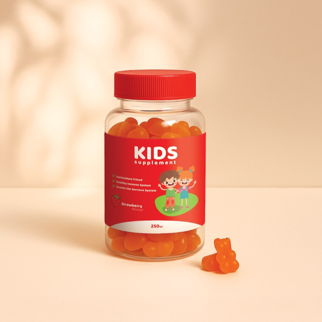
Hold a label between your fingers, and it seems straightforward enough. A rectangle of paper or film with your brand on it. Then you apply it to a bottle, step back, and something goes wrong. The logo sits slightly low. One edge lifts. Half the text curls away from view. Custom labels behave differently once they meet a three-dimensional object, and the problems that appear at that moment have almost nothing to do with the artwork itself.
This is the stage where most disappointment happens, not at design, not at printing, but at application. Getting custom labels to sit properly on a bottle involves geometry, adhesive behaviour, and a bit of patience most people don’t budget for. Here is what actually goes wrong.
Curved Surfaces Hide More of Your Design Than Expected
Wrap a flat label around a cylinder and a chunk of it disappears from any single viewpoint.
Someone standing in front of a 330ml bottle sees roughly 40 per cent of the label surface. The rest curves away.
That changes where things belong. Your product name and logo need to sit in the middle third, not spread edge to edge. Contact details, volume statements, and supplier information can live out at the sides, since someone already holding the bottle reads them.
A brewer in Marrickville once described turning every bottle on the shelf by hand because the logo had drifted around the back. Small problem. Deeply annoying.
Tapered Bottles and the Wrinkle Problem
Not every container is a true cylinder. Plenty are narrow towards the neck or flare at the base.
A flat rectangle cannot sit smoothly on a surface that curves in two directions. It buckles, usually along the top edge.
Let’s break it down by shape:
- Straight-sided bottles and jars accept almost any label shape.
- Gently tapered containers work with shorter labels that avoid the steepest section.
- Strongly tapered bottles suit smaller circles or squares placed on the flattest area.
- Shouldered bottles need the label kept well below the curve.
Measure the flat working height before choosing dimensions. The widest part of a bottle is rarely the usable part.
Adhesive Behaviour on Different Container Materials
Labels stick to some surfaces better than others, which can catch people out.
Glass is the easiest, as long as it’s clean and dry. Coated aluminium cans are usually fine. Certain plastics, particularly those with a slightly waxy feel, resist adhesion for the first day or two.
Temperature matters too. Applying labels to cold bottles straight from a fridge means moisture forms on the surface, and the adhesive never gets proper contact.
Let bottles reach room temperature first. Wipe them with isopropyl alcohol if there is any residue from filling. Then apply.
Adhesive needs time to reach full strength, often around 24 hours. Judge your result the next morning rather than immediately.
Water Resistance Is About Where the Product Lives
Condensation causes more label failures than anything else.
A bottle of cold brew or a gin bottle that sits in ice picks up moisture across its whole surface.
Polypropylene handles it. The material does not absorb water, so labels stay flat and printed colour stays sharp on drinks that spend their life in a fridge. The same applies to bathroom products, where a serum or body oil gets handled with wet hands repeatedly.
Worth saying clearly, polypropylene suits indoor product use rather than anything left outdoors in sun and weather for months.
Hand Application Mistakes That Ruin Good Labels
Applying labels by hand is genuinely harder than it looks, especially the first hundred.
Common errors show up fast:
- Starting from one end and stretching, which creates a diagonal drift
- Trapping air bubbles by pressing down the middle first
- Touching the adhesive with fingers, leaving oils that weaken the bond
- Applying at an angle, then noticing only after ten bottles
Try the centre-out method. Position the label, press down the middle line, then smooth outward towards both edges.
Since labels come on rolls rather than sheets, peeling is quicker, and the edge stays clean. Some people build a simple cardboard jig to hold the bottle at a consistent height. Cheap, slightly ugly, works well.
Judge the Label on the Bottle, Never on the Screen
Approving artwork on a laptop tells you how the file looks. It tells you almost nothing about how the product will look in someone’s hand.
Every decision- material, shape, size and placement- needs testing against the real container before the full run goes ahead.
Spend an afternoon on it. Your customers only ever see the version on the bottle.
